At TAFE this semester, we have been learning a little about Photoshop and using it to create art pieces. All I can say is that I just love what I can do with Photoshop! Love it, love it, love it! So far we have just touched the tip of the iceberg in class, but I think my background in computing is helping me to grasp the principles fairly quickly. I must admit that I just love colour and in "Visit the Zoo"(below) I drew on August Macke (German expressionist early 1900's) for inspiration from his colourful "Zoo" series. In my work "The Dancers" (below), of course my inspiration was Andy Warhol.
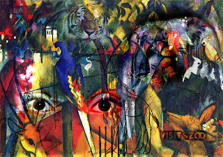 |
Visit the Zoo
|
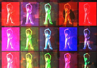 |
The Dancers
|
DIGITAL COLLAGE
Our first digital collage project required us to collect some objects from about the home, scan them into the computer, and then create some digital collage. Objects I collected included an old pianola roll, old photos of my grandparents, an old crocheted doilley, and various pieces of fabric from my stash. Here are my efforts so far using these scanned objects in Photoshop. The two works "The Rose 1" and "The Rose 2" are tributes to my grandparents.
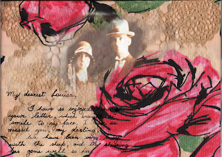 |
| The Rose 1 |
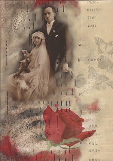 |
| The Rose 2 |
The work "Tommy" is a tribute to our aboriginal guide at Oenpelli in the Northern Territory - a very quiet spoken gentleman by the name of Tommy. To create this work, I overlaid an Aboriginal flag, a photo of Tommy, a piece of material of Aboriginal motifs I bought in Alice Springs, and a "red centre" landscape of my own.
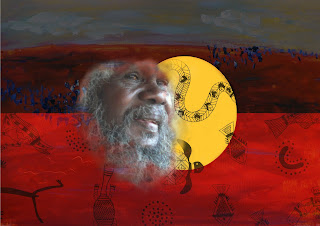 |
| Tommy |


